
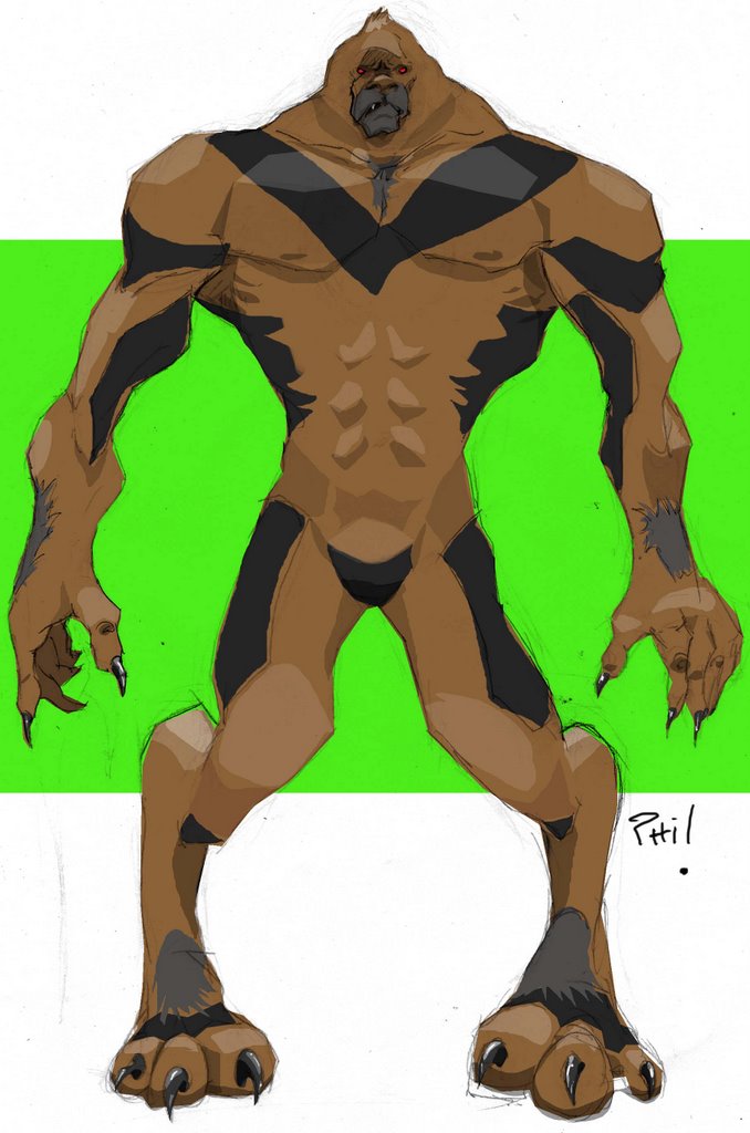
I really had fun with shape on this one.....can you tell. I also really got into making sure I was cutting out the form with light, medium, and dark tones. Let me know what you guys think of this one. He taught me a few things! lol
*Update* 11/21/06.....Added another character. Here costume was fun and I liked the contrast between the blue and pink color.
9 comments:
im diggin these. . .i like the design of the chick and the shape of the other is great! . . nice job
Me too! I really love the interesting colours you've chosen, it gives them so much character. I love the green woman in the post before as well, a very solid drawing :)
You guys both rock so thanks for the comments. Now if I could only jack roc's line work skills and sarah's painting skills......lol Drawing these characters has really been a good learning experience. I was getting burnt out there for a min with work but I got my drawing wind back so to speak. Well, back to work.
hey dude! These are Great! Nice job on the logo too.
you are really getting good in illustrator and photoshop , seriously, nice paintings.
Amazing designs!! Great shapes, and nice colors.
I like that top one a lot. Looks like it could fit nicely into a science fiction universe.
Thanks guys!
Jerm- Thanks a lot. I have been trying really hard over the last few months to improve little by little and learn as much as I can.
Christian- Thanks! These recent characters have taught me a lot about shape.
Marco- I think I was in Farscape mode when I colored her! lol Always a pleasure to have you stop by sir.
As always,
great use of color. I especially like the female, how the saturated clors contrast with the muted colors. She kind of reminds me of Mystique from X-Men.
Nice artwork!
Post a Comment