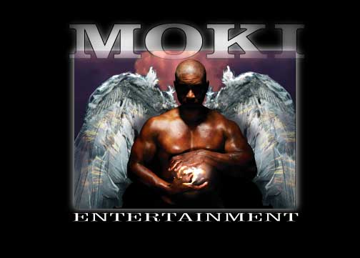
This is a logo I am currently working on for Moki Entertainment Inc. I have been learning how to manipulate photographs with photoshop recently which is a new thing for me. It is hard but I am starting to pick up a few tricks here and there. Let me know what you think. I should be finished with it sometime later on today.
5 comments:
I like it. That image is very powerful and it looks very clean. I think I would like it more without the box, or if the background was darker? Nice job.
Thank you again for the really nice comments on my blog :) I like the logo, particularly the wings. I really enjoyed reading your previous post too... what a very cool job you have.
np Sarah...your art has really been inspiring me lately....just a great illustrated style...thanks for coming by and commenting. Stop by whenever you like!
Thanks for the critique Neil...I changed the final product because of it and I think it works a whole lot better now.
Nice design. It works really well with value and focal point. If I had any critiques I would say to hone in the color scheme a little more.
Thanks Adam....I turned in the final already but one of my close friends told me the same thing. I really appreciate the critque...especially since it is a great one! Stop by anytime.
Post a Comment